 blog
Hippie Aesthetic Web Design Ideas for 2026
Table of Contents
- What Defines Hippie Aesthetic Web Design
- Earthy Website Color Palettes That Capture the Vibe
- Bohemian Typography Styles and Hand-Lettering
- Boho Chic Web Design Layouts and Composition
- Retro 70s Website Inspiration and Imagery
- Balancing Aesthetic Appeal with Accessibility and Usability
- Bringing Hippie Web Design to Life
- Frequently Asked Questions
Last Updated: October 11, 2026
What Defines Hippie Aesthetic Web Design
Hippie aesthetic web design blends 1960s-70s counterculture values with modern digital design, celebrating peace, nature, and individual expression through organic, eclectic visuals. This approach rejects rigid grids and corporate polish in favor of hand-drawn illustrations, warm earth tones, and intentional visual chaos that invites exploration.
The core of this aesthetic lies in authenticity: hippie web design prioritizes soul and meaning over strict design rules.
Key characteristics include:
- Organic, flowing layouts that resist predictability
- Hand-lettered typography and decorative fonts
- Natural imagery featuring flowers, leaves, and celestial elements
- Maximalist composition with layered textures and patterns
- Color palettes rooted in nature: terracotta, sage, mustard, and cream
Earthy Website Color Palettes That Capture the Vibe
Earthy color palettes form the foundation of hippie aesthetic web design, evoking natural landscapes and creating emotional connection to nature.
Effective palettes combine warm terracotta, sage green, mustard yellow, cream, and burnt orange for visual warmth. Secondary colors, olive green, rust, warm tan, and deep plum, add depth and contrast.
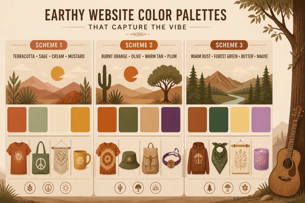
Practical application tips:
- Use warm neutrals (cream, tan, warm gray) as your base for 60% of the page
- Apply earthy accent colors (sage, terracotta, mustard) for 30% of visual elements
- Reserve deep jewel tones (plum, forest green, rust) for 10% to create focal points
- Test color combinations against white backgrounds to ensure readability
Bohemian Typography Styles and Hand-Lettering
Bohemian typography rejects uniformity for personality and warmth, using organic letterforms and decorative flourishes.
Practical Font Pairing Strategy
Use a three-tier typography system:
- Display/Hero Font (Headlines, H1-H2): Hand-drawn, brush-style, or vintage serif with irregular baselines and organic letterforms. Use at 48px-72px on desktop, 28px-36px on mobile.
- Secondary Font (Subheadings, H3-H4, Accent Text): A warm serif or slightly decorative sans-serif with character but better readability than the display font. Use at 24px-32px on desktop, 18px-24px on mobile.
- Body Font (Paragraph Text, Navigation, UI): A clean, highly legible sans-serif with neutral personality. Aim for 16px-18px on desktop, 14px-16px on mobile. Ensure a line-height of 1.6-1.8 for comfortable reading.
Implementation Guidance
When pairing fonts:
- Limit display fonts to headlines and accents only to preserve scannability.
- Pair expressive display fonts with neutral body fonts for contrast without overload.
- Use font-weight variation within a single family to reduce file size and improve page speed.
- Set consistent line-height: body text at 1.6-1.8, headings at 1.2-1.4.
Responsive Typography Rules
Decorative fonts degrade on mobile.
Accessibility and Readability
Hand-lettered typography signals authenticity but readability is essential. Ensure 4.5:1 color contrast for body text, 3:1 for large text (WCAG AA).
Font Sourcing and Performance
Use variable fonts where possible to reduce file size. Limit to 2-3 font families total; each additional font adds 20-50 KB.
Boho Chic Web Design Layouts and Composition
Boho chic layouts embrace asymmetry and unexpected compositions while maintaining usability. Offset elements, overlapping sections, and organic whitespace replace rigid grids. However, asymmetry requires intentional responsive design and clear information hierarchy to avoid chaos on mobile.
Asymmetrical Grid Systems and Desktop Composition
Effective boho layouts use flexible grids with uneven column spans (e.g., 10-col + 6-col). Layer content with negative margins for depth. Use curved SVG dividers instead of straight lines.
Responsive Behavior: Desktop to Mobile
Asymmetrical layouts break down on small screens. A two-column offset layout on desktop becomes a single column on mobile, and overlapping elements stack unpredictably. Plan responsive behavior explicitly:
- Breakpoint Strategy: Define breakpoints at 1440px (desktop), 1024px (tablet), 768px (large mobile), and 375px (small mobile). At each breakpoint, reassess layout, font sizes, and element visibility.
- Column Reflow: On tablets and mobile, convert multi-column layouts to single-column stacks. A 10-column + 6-column layout on desktop becomes full-width on mobile. Use CSS Grid or Flexbox with
flex-direction: columnto reflow automatically. - Overlapping Elements: Overlaps that work on desktop (e.g., a 60px negative margin) may cause content to overlap text on mobile. Use media queries to remove negative margins below 768px width, allowing elements to stack naturally.
- Decorative Elements: Hero images, background patterns, and ornamental dividers may consume excessive space on mobile. Hide or simplify them below 768px using
display: noneorvisibility: hidden. Prioritize content over decoration on small screens. - Navigation Adaptation: Asymmetrical header layouts (e.g., logo on left, nav on right with uneven spacing) often don't fit mobile screens. Use a hamburger menu or stacked navigation on mobile, maintaining the boho aesthetic through typography and color rather than layout complexity.
Navigation and Information Hierarchy
Asymmetry can obscure navigation if not carefully managed:
- Primary Navigation Placement: Keep primary navigation in a predictable location (top-left, top-right, or hamburger menu on mobile). Users expect to find navigation in standard locations; asymmetry in content is fine, but navigation should be intuitive.
- Visual Hierarchy: Use size, color, and spacing to guide users to key content. The most important call-to-action should be visually prominent, even in an asymmetrical layout. Avoid burying CTAs in decorative elements.
- Whitespace as Structure: Generous, intentional whitespace creates breathing room and separates sections. In asymmetrical layouts, whitespace acts as a visual anchor, helping users understand the page structure.
- Breadcrumbs and Wayfinding: On complex boho sites (e.g., e-commerce with many product categories), use breadcrumbs or a clear path to help users navigate. Asymmetry can make it hard to understand where you are in the site hierarchy.
Layout Component Examples
| Layout Pattern | Desktop Behavior | Mobile Behavior | Best Use Case |
|---|---|---|---|
| Hero + Offset Text | 60% image right, 40% text left, 20px gutter | Full-width image, text below | Landing pages, product launches |
| Overlapping Cards | Cards offset by 40-60px, layered with shadows | Cards stack vertically, no offset | Testimonials, case studies |
| Asymmetrical Grid | 10-col + 6-col layout with uneven margins | Single column, full-width | Blog listings, portfolio grids |
| Curved Dividers | SVG curves between sections | Simplify or remove curves below 768px | Section breaks, visual interest |
| Sidebar + Content | 25% sidebar left, 75% content right | Sidebar moves below content | Blogs, documentation |
Performance and Rendering
Complex layouts with overlaps, curves, and layered textures can slow page rendering:
- CSS Containment: Use
contain: layouton sections with complex positioning to isolate rendering. This prevents the browser from recalculating the entire page when one section changes. - Image Optimization: Decorative background images and overlays should be compressed and served in modern formats (WebP). A 2 MB background image can slow mobile load times by 2-3 seconds.
- SVG Optimization: Hand-drawn dividers and decorative SVGs should be minified and inlined where possible. Remove unnecessary metadata and simplify paths to reduce file size.
- Lazy Loading: Defer loading of below-the-fold images and decorative elements using
loading="lazy"or Intersection Observer API. This improves initial page load time.
Retro 70s Website Inspiration and Imagery
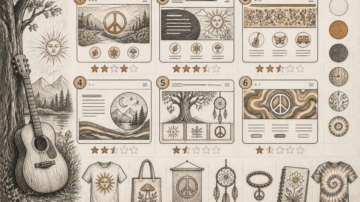
Retro 70s website inspiration draws directly from the visual language of the 1970s counterculture: bold geometric patterns, psychedelic swirls, nature photography, and vintage illustration styles. This era produced some of the most recognizable hippie visual symbols.
Imagery that captures the retro 70s vibe includes:
- Botanical illustrations and wildflower drawings
- Psychedelic mandala patterns and geometric designs
- Vintage concert posters and album artwork
- Peace symbols and celestial motifs (moons, stars, suns)
- Warm-toned photography with soft focus and natural lighting
The strongest retro 70s websites combine photographic imagery with illustration, creating a mixed-media aesthetic. Vintage filters and slightly faded color treatments enhance authenticity without looking dated.
Balancing Aesthetic Appeal with Accessibility and Usability
Hippie aesthetic web design can prioritize visual richness, but accessibility and usability must never be sacrificed. A beautiful website that confuses visitors or excludes people with disabilities fails its core purpose.
Critical accessibility considerations:
- Ensure sufficient color contrast between text and backgrounds (WCAG AA standard minimum)
- Use semantic HTML and proper heading hierarchy for screen readers
- Provide alt text for all decorative and functional images
- Design for keyboard navigation, not just mouse interaction
- Test readability across different font sizes and zoom levels
Usability best practices for boho designs:
- Maintain clear visual hierarchy despite asymmetrical layouts
- Keep navigation intuitive and findable (typically top or left-aligned)
- Use whitespace strategically to prevent visual overwhelm
- Ensure buttons and interactive elements are clearly clickable
- Test loading times, ornate designs with heavy graphics can slow pages
- Design responsive layouts that adapt gracefully to mobile screens
The goal is creating a design that feels organic and free while respecting the needs of all visitors.
Bringing Hippie Web Design to Life
Transforming hippie aesthetic web design ideas into a functioning website requires balancing artistic vision with technical execution.
Implementation steps:
- Define your color palette and create a style guide
- Select 2-3 primary fonts and establish hierarchy rules
- Create a wireframe that respects your asymmetrical vision
- Source or commission original artwork and photography
- Build modular components that maintain consistency
- Test extensively across devices and browsers
Custom design services like those offered at RastaHippies.com can bring this vision to life while ensuring your brand values shine through.
The most memorable hippie-inspired websites tell a story. They communicate what the brand believes in through every visual choice. That authenticity resonates far more than perfectly executed design without purpose.
Frequently Asked Questions
What are the core visual elements of a hippie aesthetic web design?
Hippie aesthetic web design combines organic shapes, nature-inspired imagery, and vibrant or earthy color palettes. Key elements include hand-drawn illustrations, decorative borders, psychedelic patterns, mandala motifs, floral graphics, tie-dye textures, and peace symbols. Typography often features display fonts with a retro feel, and layouts embrace eclectic, maximalist composition rather than rigid grids. The overall effect celebrates individuality and natural forms while evoking the spiritual and artistic values of the 1960s-70s counterculture.
How can I incorporate bohemian style into modern web design without sacrificing usability?
Start by using earthy color palettes as your foundation rather than overwhelming visitors with competing colors. Pair decorative elements like hand-lettering and illustrations with clean, readable sans-serif fonts for body text. Create clear visual hierarchy so ornamental details enhance rather than obscure navigation. Use whitespace strategically to prevent the design from feeling cluttered. Test your layout on mobile devices to ensure responsive design works across all screen sizes. Ensure text contrast meets accessibility standards so colorful backgrounds don't reduce readability. This approach lets you celebrate the boho aesthetic while keeping the site functional and welcoming to all visitors.
What color palettes best represent a hippie-inspired website?
Earthy website color palettes work best for hippie aesthetic design. Consider combinations like warm terracotta with sage green and cream, or mustard yellow paired with burnt orange and natural beige. Olive greens, warm browns, and soft golds also evoke the era authentically. For accent colors, incorporate warm corals, rust, or muted purples. Avoid neon or overly saturated colors unless they're used sparingly as highlights. These palettes feel grounded and natural while honoring the peace-loving, nature-connected values of hippie culture. Test your chosen palette across different devices to ensure colors remain true and readable.
What typography works best for a boho-chic website?
Bohemian typography styles blend decorative and functional fonts. Use a distinctive display font with organic, hand-drawn, or slightly irregular characteristics for headlines and branding elements. Serif fonts with a vintage feel work well for subheadings, while clean sans-serif fonts keep body text accessible. Hand-lettering or script fonts can accent key messaging, but use them sparingly to maintain readability. Pair fonts thoughtfully so they complement rather than compete. Ensure your chosen typefaces scale well on mobile devices and maintain legibility at all sizes. The goal is creating visual interest through typography without compromising the user's ability to quickly scan and understand your content.
Creating a website with genuine hippie aesthetic requires more than trendy visuals, it demands alignment between your design, your values, and your audience. RastaHippies.com specializes in custom web design services that unite visual authenticity with functional design, helping brands celebrate peace, nature, and individual expression while supporting charitable foundations dedicated to environmental conservation. Explore how custom design can authentically represent your brand's story.