 listicle
Bohemian Graphic Design for Business: A 2026 Guide
Table of Contents
- What Defines Bohemian Graphic Design for Business
- Boho Chic Branding Examples That Work
- How to Create a Bohemian Brand Identity
- Best Fonts for Bohemian Graphic Design
- Applying Bohemian Design Across Business Touchpoints
- Layered Patterns and Mixed Design Elements
- Choosing the Right Bohemian Style for Your Audience
- Frequently Asked Questions
Last Updated: October 17, 2026
What Defines Bohemian Graphic Design for Business
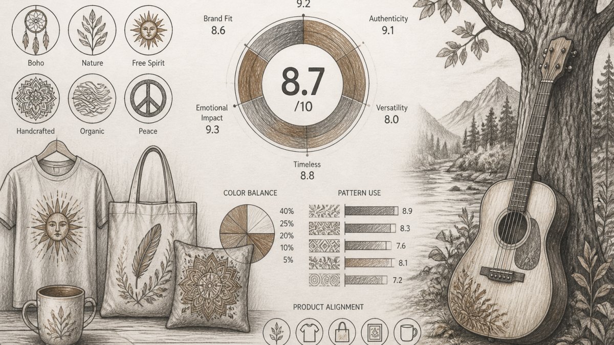
Bohemian graphic design for business combines earthy tones, organic shapes, and eclectic visual storytelling to create brand identities that feel authentic and nature-inspired.
The boho aesthetic rejects rigid geometry and corporate sterility. Instead, it embraces warm colors, botanical motifs, hand-drawn elements, and layered compositions that feel lived-in and intentional.
What makes this style effective for business is its authenticity. A bohemian visual identity communicates that your business prioritizes quality, creativity, and purpose, whether you're selling handcrafted apparel, wellness products, or custom design services.
The challenge lies in execution. Bohemian design can easily tip into cluttered or amateurish territory without strategic choices about color, typography, and composition.
Boho Chic Branding Examples That Work
Successful bohemian branding combines recognizable visual markers, earthy palettes, botanical elements, organic typography, with a clear point of view about what the brand stands for.
Consider how wellness and lifestyle brands use boho aesthetics.
Apparel brands embracing bohemian branding often feature hand-drawn patterns, retro color combinations, and nature-inspired imagery on everything from product tags to social media graphics.
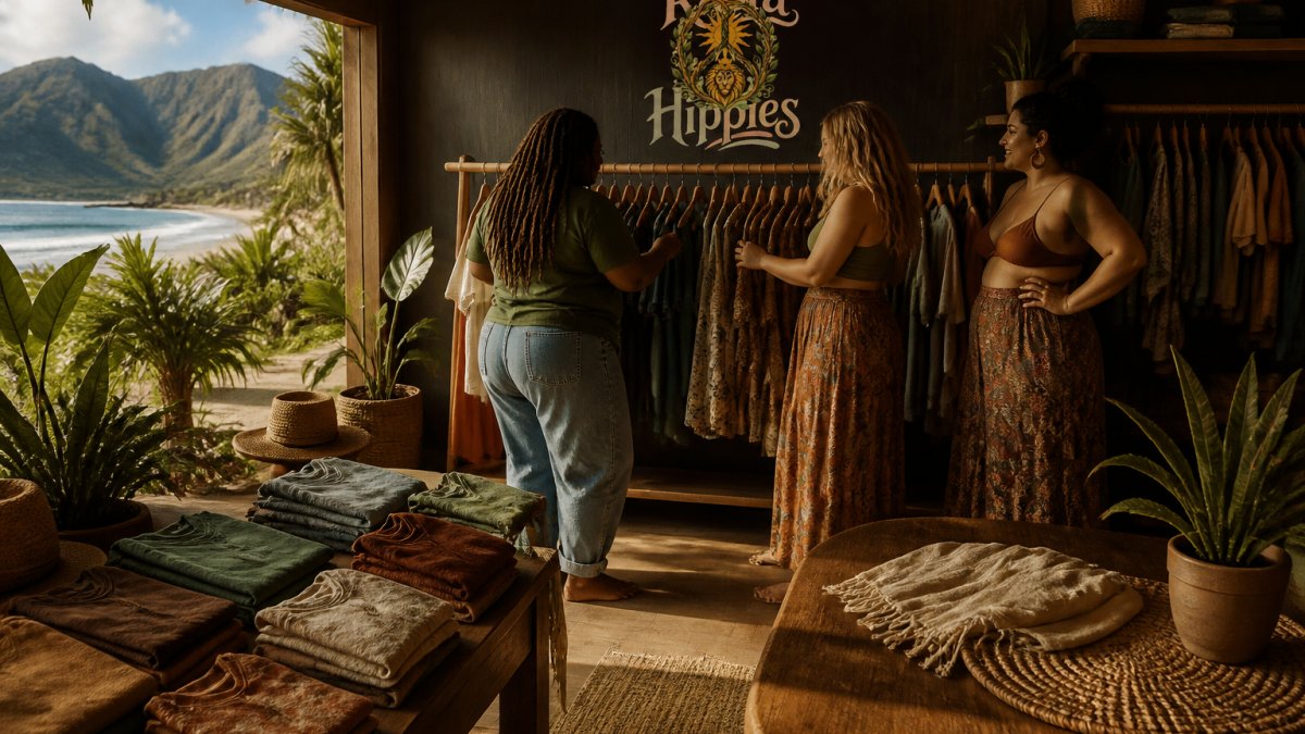
Rasta Hippies exemplifies this approach through original art and handcrafted merchandise rooted in positive energy. Their custom logo and web design services help other businesses build bohemian brand identities that celebrate cultural unity and nature-inspired creativity.
The common thread across effective boho branding: intentionality. Every color choice, every pattern, every typography decision reflects a deliberate vision rather than random eclecticism.
How to Create a Bohemian Brand Identity
Start by clarifying what bohemian values actually mean for your specific business. Bohemian culture emphasizes freedom, creativity, sustainability, and connection to nature, but your brand's interpretation will be unique. Are you emphasizing environmental conservation? Spiritual wellness? Cultural celebration? Artistic expression?
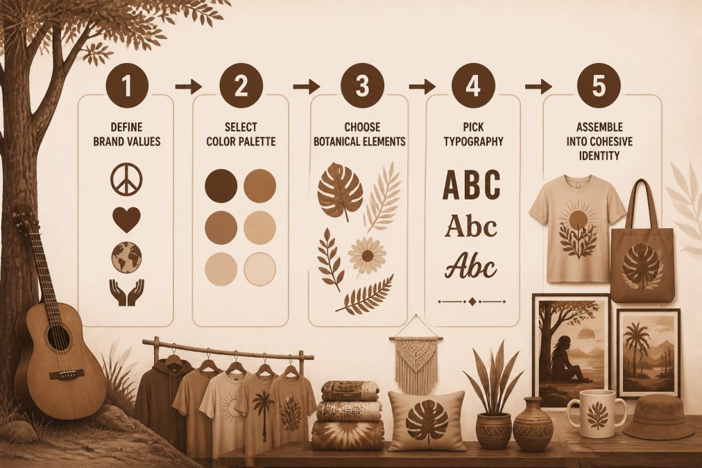
Once your values are clear, build a mood board. Collect images, color combinations, typography samples, and pattern references that feel aligned with your vision.
Next, develop your color story. Bohemian palettes typically feature warm, earthy tones, terracotta, ochre, sage green, cream, warm brown, combined with jewel tones or muted jewels for depth.
Color Palettes That Capture the Boho Aesthetic
Earthy and warm color palettes form the foundation of bohemian graphic design. These colors connect visually to nature, soil, plants, natural light, and evoke feelings of calm, authenticity, and groundedness.
A strong boho palette typically includes:
- Warm neutrals: Cream, ivory, warm gray, natural linen tones
- Earth tones: Terracotta, rust, ochre, warm brown, sand
- Muted greens: Sage, olive, moss, celadon
- Accent colors: Warm gold, dusty rose, muted burgundy, or soft peachy tones
The most effective bohemian palettes limit the number of colors and prioritize harmony over variety. Rather than using five different greens, choose one sage tone and pair it consistently with warm neutrals and one accent color. This creates visual breathing room and makes your brand recognizable.
Consider how color functions across different applications. A palette that looks beautiful on a mood board might feel overwhelming on a business card or website if every color competes for attention. Test your palette by applying it to real mockups, logos, social media templates, packaging, before committing.
Botanical Motifs and Nature-Inspired Elements
Botanical imagery and organic shapes are visual signatures of bohemian graphic design. These elements communicate connection to nature and add visual interest without requiring photorealism.
Effective botanical elements for business graphics include:
- Line drawings: Minimalist illustrations of flowers, leaves, vines, or branches in single-line or simple multi-line style
- Pressed-flower patterns: Vintage-inspired arrangements of dried botanicals
- Organic shapes: Irregular circles, flowing curves, asymmetrical forms inspired by natural structures
- Layered compositions: Multiple botanical elements overlapping to create depth and movement
- Retro botanical illustrations: Vintage scientific or artistic plant drawings
The key is intentional placement. Rather than filling your logo or business card with botanical clutter, use botanical elements strategically, as borders, background accents, or focal points. This approach maintains readability while reinforcing the bohemian aesthetic.
Many bohemian designs layer multiple botanical elements to create visual richness. A business card might feature a simple line-drawn flower as the primary logo, with delicate vines framing the edges and dried-leaf patterns as subtle background texture. This layering technique creates depth and sophistication.
Best Fonts for Bohemian Graphic Design
Typography choices dramatically shape how a bohemian brand feels. The right fonts communicate creativity and authenticity; the wrong ones undermine the entire visual identity.
Effective bohemian typography typically includes:
- Hand-lettered or script fonts: Flowing, organic letterforms that feel personal and artistic
- Vintage serif fonts: Classic, slightly worn typefaces that suggest heritage and timelessness
- Geometric sans-serifs with organic modifications: Modern fonts with rounded corners or slightly irregular letterforms
- Retro display fonts: Bold, decorative fonts inspired by 1970s or bohemian-era design
- Condensed or extended fonts: Unusual proportions that add visual interest
The strongest bohemian designs pair two fonts: a distinctive display font for headlines and a highly readable sans-serif for body text. This combination balances visual personality with functional clarity.
Avoid overly ornate or difficult-to-read fonts, even if they feel "bohemian." Your business card, website, and packaging need to communicate clearly. The font should feel bohemian through its character, rounded edges, organic irregularity, vintage inspiration, not through illegibility.
Consider how fonts appear across different sizes and contexts. A beautiful hand-lettered font might work perfectly for a logo but become unreadable when used for body copy on a website.
Applying Bohemian Design Across Business Touchpoints
Bohemian graphic design only works when applied consistently across all customer touchpoints. A beautiful bohemian logo loses impact if your business card, website, social media, and packaging don't reinforce the same visual language.
Key touchpoints to consider:
- Logo and primary mark: The visual anchor for your entire brand identity
- Business cards and stationery: Printed materials that communicate professionalism and creativity
- Website and digital presence: Where most customers form their first impression
- Social media graphics: Templates for posts, stories, and promotional content
- Packaging and labels: Physical touchpoints that create unboxing experiences
- Email templates: Branded communications that reinforce visual consistency
- Marketing collateral: Brochures, flyers, and promotional materials
Each touchpoint should feel intentional rather than random. Use your core color palette consistently. Repeat your botanical elements and typography choices. Maintain similar compositional approaches, if your logo uses layered elements and organic shapes, apply that principle to your website design and social media templates.
Layered Patterns and Mixed Design Elements
Layered compositions and mixed patterns create visual richness in bohemian graphic design. This technique, combining multiple botanical elements, color layers, and pattern types, distinguishes sophisticated boho design from amateur attempts.
Effective layering involves:
- Depth through overlapping: Place elements at different depths to create visual hierarchy and movement
- Pattern mixing: Combine geometric patterns with organic shapes, or mix different botanical motifs
- Color layering: Use transparency and color overlaps to create new tones and visual complexity
- Texture combinations: Blend smooth elements with textured or hand-drawn components
- Scale variation: Use elements at different sizes to create visual interest and guide the eye
The challenge is avoiding visual chaos. Too many layers, patterns, and colors create overwhelming clutter. The strongest layered designs use clear hierarchy, one dominant focal point, supporting elements that enhance rather than compete, and plenty of white space to let the design breathe.
Consider how layered patterns function in your specific applications. A layered, intricate pattern might work beautifully on packaging or a large poster but become illegible when reduced to a small social media thumbnail. Design with your actual use cases in mind.
| Design Element | Best Application | Visual Impact | Readability |
|---|---|---|---|
| Simple botanical line drawing | Logo, favicon, small graphics | Clean, professional | Excellent |
| Layered botanical patterns | Packaging, large posters, backgrounds | Rich, visually interesting | Good |
| Mixed botanical + geometric patterns | Social media, web headers | Dynamic, contemporary boho | Moderate, test at actual size |
| Dense layered compositions | Full-bleed packaging, art prints | Artistic, immersive | Varies by design |
Choosing the Right Bohemian Style for Your Audience
Not all bohemian design resonates equally with every audience. The specific interpretation of bohemian aesthetics should align with your target customer's values and visual preferences.
Consider these audience segments:
- Wellness and spirituality-focused customers: Respond to soft, dreamy palettes with celestial or nature-inspired elements. Minimalist bohemian approaches work better than maximalist designs.
- Environmental and sustainability-conscious buyers: Prefer earth tones, botanical imagery, and organic shapes that communicate connection to nature. They appreciate transparency about sustainable practices reflected in authentic, unpretentious design.
- Artistic and creative communities: Embrace maximalist layered patterns, bold color combinations, and eclectic typography. They value visual experimentation and originality.
- Cultural heritage and music-inspired audiences: Connect with bohemian design that references specific cultural traditions, retro aesthetics, and community values. Authenticity matters more than trend-following.
- Young, socially conscious consumers: Respond to contemporary bohemian design that balances retro inspiration with modern sensibilities. They appreciate brands that take clear stances on social and environmental issues.
Research your specific audience before finalizing your bohemian aesthetic. What visual language already resonates with them? What values do they express through their own choices in fashion, home decor, and media consumption?
The most successful bohemian branding feels inevitable, like the visual language the brand was always meant to speak. This alignment between brand aesthetic and audience values builds trust and recognition.
Bohemian graphic design for business works because it communicates authenticity, creativity, and values alignment in a visual language that increasingly matters to conscious consumers.
The brands that succeed with bohemian aesthetics treat design as a complete system rather than isolated graphics.
For entrepreneurs seeking to build bohemian brand identities that celebrate cultural unity, sustainability, and creative expression, consider exploring custom design services that specialize in this aesthetic. Their commitment to supporting charitable foundations dedicated to ocean and environmental conservation aligns with the values that drive bohemian branding.
Frequently Asked Questions
What defines the bohemian aesthetic in graphic design?
Bohemian graphic design blends earthy tones, organic shapes, botanical motifs, and layered patterns to create a warm, nature-inspired visual identity. The style embraces imperfection, eclectic elements, and whimsical details that reflect freedom and individuality. In business graphics, boho design conveys authenticity and emotional connection, making it especially effective for wellness, lifestyle, and creative brands that value sustainability and personal expression.
How do I incorporate nature-inspired motifs into my business logo?
Start by selecting botanical elements that align with your brand values: flowers, vines, leaves, or organic shapes that feel authentic to your business. Layer these elements with custom typography to create depth. Use vector art to ensure your logo scales cleanly across business cards, websites, and print materials. Consider whether you want a minimalist approach with one central plant motif or a more maximalist design with layered botanicals. Test your logo at different sizes to confirm it remains legible and impactful.
Is bohemian graphic design suitable for professional corporate brands?
Bohemian design works best for brands that align with wellness, creativity, sustainability, and authenticity. Corporate sectors like finance or law typically benefit from more formal aesthetics. However, contemporary boho, which blends modern minimalism with nature-inspired elements, can add warmth and approachability to professional brands without sacrificing credibility. The key is balancing eclectic boho elements with clean typography and strategic use of whitespace to maintain professionalism while expressing brand personality.
What color palettes are essential for a bohemian brand identity?
Earthy and warm colors form the foundation of boho palettes: terracotta, sage green, warm ochre, dusty rose, and deep browns. Complement these with accent colors like burnt orange, mustard yellow, or muted teal. These combinations feel grounded and nature-connected. Avoid bright neons; instead, opt for muted, heritage-rooted tones that evoke warmth and authenticity. Your color palette should appear consistently across logos, business cards, website backgrounds, and marketing materials to reinforce brand recognition.
How can bohemian design elements improve brand trust?
Bohemian design signals authenticity, intentionality, and values alignment. When audiences see earthy tones, botanical motifs, and organic typography, they perceive a brand as genuine and conscious rather than mass-produced. This aesthetic resonates strongly with environmentally aware consumers and those seeking personal expression. By applying boho design consistently across all touchpoints, from packaging to web design, you reinforce trust through visual coherence and emotional resonance, making customers feel your brand shares their values.